Tuesday, October 29, 2013

some thoughts on an odd car

So I was trying to make a wheelbase for a sports car design and I measured wrong so it went too wide. For some reason I decided to go with it and make it an asymmetrical design with weird engine parts taking up a side. Now I see the sketch as pretty sloppy and awful in alot of ways, but hey, I was having fun.
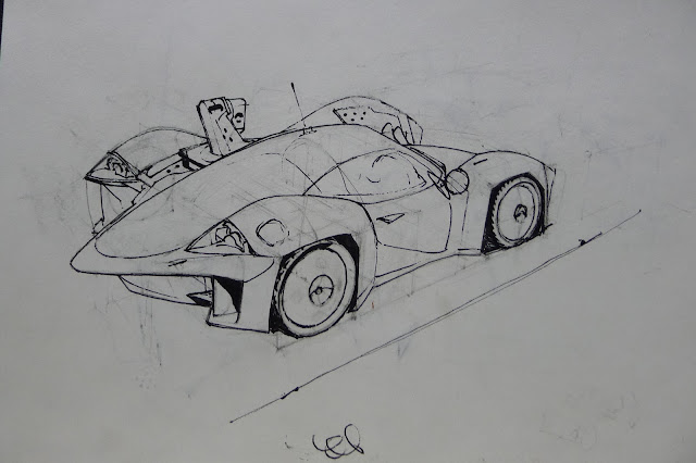
So afterwards I took this sketch, put it in gimp (photoshop works the same though) and put it on an overhead layer set to "darken". That way you can color under your lines! I also had a magazine picture laying beside me of a pretty looking car. I used that as reference for the reflections,color, and overall value scheme. Heres a process:
I think mid tonally ranged reflections like this are very pretty. Its not just streaking white all over the car. Generally there will be flowing "cells" of reflection that darken somewhat in the middle areas and solidify to a hard sharp edge along the outsides. In order to get this effect digitally, layers and transparency are your friend. "Transparency" is simply a setting you click in the layer box so that when you paint the colors stay within the preexisting shapes on that layer. The reason this masking technique is so important in achieving these shapes is because gradients/soft brushes can be horrible to try to freely paint with when they go wrecking over edges that need to stay sharply defined. Sortof like if my sentence runs on over the per.iod

So, firstly I divided the upper body and window reflections from the darker red of the lower body and the black of the canopy bubble. I kept these separate from each other too, since they used different colors. First I painted them with a hard round brush in the lightest and darkest colors in the reflection. All you have to do after that is soften the interior of the reflection shape with a gradient brush! So thats what you see in the first pic of the example. It looks pretty boring, but contains the foundational lighting information. After that is just adding the painterly bells and whistles overtop. Towards the end I also started erasing from the line drawing, the more finished looking the car got the more gnarly looking the lines looked.

I will be remembering this stuff next time I paint a car! here's how it turned out:
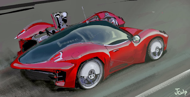
As an added note you can see that the midtonal red is too strong, too bright in comparison to how it should be. Blogger's image system can't handle the reds well, the correct version can be seen on my CGhub : here

Thursday, September 13, 2012

getting into BIG BRUSHES

 I'm trying to get some practice with big brushes lately, and wondering about silhouettes. I was always abit confused by all the big brush talk i heard from artists. Perhaps you've heard of the B.L.A.S.T. rule? (I got it from James Gurney, i guess he invented the wording, though its always been a thing amongst naturalistic painters, theres some great quotes from Sargent on this)

"Big Brushes.
Large to small.
Accents last.
Soften edges.
Take your time."

 Its easy to understand these thoughts in theory, the idea essentially being simpler=better, or a general way to eliminate ''noodling'' that screws up the orderly process of painting 'important' stuff first. But its still not specific enough to me- also in that it applies to a pretty specific type of painting, which is lit scenes. You can't really apply it to styles that don't use big blocks of colortone to make the point.

                  I've been noticing some cool things from using big brushes in digital though, i'm talking bigass brushes too, brushes that are big enough that they plow into other parts of the painting, messing shit up left and right. Because when you use brushes like this, and i suppose you only can with digital or oil, painting becomes like a puzzle. Think about how you can make a specific small shape with only the use of a huge wrecking-ball brush (like the gun in the pic). You've gotta paint a shape by painting the shape beside it. I used to focus mostly on painting 'out' from a small shape, expanding it from within, but when you paint objects by carving them from the background, interesting stuff starts to happen. Weird collusions grow and suggest things. Its great! So now you've got your shape right, but you just screwed up another shape! can you do this in a way that you get both of them right?

     The edge effect of doing things this way is very different, I used a round brush in this example, using different nib shapes will bring about different effects on how shapes form, and how they get messed up. I'm noticing a huge difference in how contours appear with this "additive subtractive wreckingball" way, as opposed to the ''painting shapes outward'' way- its easier to get clean, swooping, simple edges.

      That's just some of the stuff I'm noticing right now. i like it. the puzzle aspect mostly. The puzzleness of it makes even the simplest shapes a challenging venture- the feet and legs of the little tophat-guy took like 10 passes before i got it right. It's worth mentioning that there is a point where you want to start detailing, and of course the wrecking ball method becomes a hindrance. So, like any other tool, drop it! or masochistically go on, i'm sure great results could be had with patience.
the blockin, i liked the funny leg stance
put some details and textures on it, viola

Wednesday, September 12, 2012

markerz

i got a mess on my hands, and it smells like catshit in here

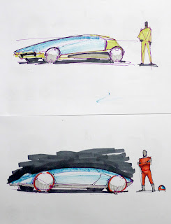
                              what better way to mask the smell than to sketch with markers?


Monday, February 20, 2012

industrial sludge


need to do more more more, click for big


sum green pics


click for big


Friday, August 19, 2011

alien poo

When I was growing up my best friend was one of those kids whos parents let him watch tv that was outof his age range (we were somewhere between 1st and 3rd grade). So  basically that meant whenever i went to his house I would come back terrified from seeing some nightmarish monster movie or gory crime murder show. Dunno where this is going, but we would play with alien and predator action figures all the time.
uugh rim light!
been thinking alot about exposure levels recently. What value range gets flattened out and what gets pumped out? I like these theatrical sortof lighting setups where the ambient filled shady areas tell the story, and the light stuff gets all blown out. Something about it strikes me as very modern and realistic I guess- we do live mostly in ambient/diffuse light here on earth don't we? Not to say other lighting/exposure situations are bad or nothin...I just like those types of scenes.